By: Felipe Argote

not easy to develop an article of this kind for the diversity of the blog readers. If it is too technical can be boring to an important segment of professionals are not economists. In contrast, if not the technical development of the concept may seem superficial to the segment formed by economists. Not to forget that the blog is primarily about economics.
To develop the distribution of national wealth and land on the distribution of wealth in Panama we must look first to the Lorenz curve to measure income inequality.
is worth mentioning that the creator of this curve Max Otto Lorenz is an American who published the concept while a doctoral student at the University of Wisconsin in 1905. It is interesting that in his doctoral thesis in 1906 makes no mention of his later famous curve that is called "Lorenz curve" from a 1922 publication called "elements of Statystical Methods." It is very easy to confuse the author with the much more famous mathematician Edward Norton Lorenz, a pioneer of the "chaos theory" and the "butterfly effect"
Lorenz curve is a measure of the relative distribution of a variant a given set. His greatest, but not the only use is to measure the concentration of wealth in a country or population group, although the Gini index to be discussed later which gives practical.

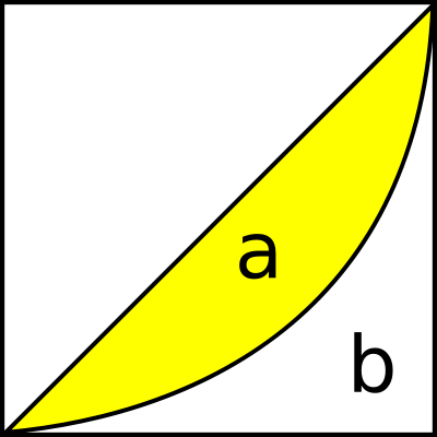
To calculate this distribution is presented on a graph where the X axis or horizontal axis lass placed the population divided into deciles (tenths) or quintiles (fifths) in ascending order cumulative , while the Y axis or axis vertrical accumulates according to their income. If the income was totally fair just for educational reasons, as this is utopian in the earthly plane the curve would be a line of 45 degrees, because the lowest income quintile would be 20% of income, 40% less income would have 40% of income and so on, 90% have 90% to 100.
But a less fanciful scenario we present the first quintile of income would be 10%, 40% of the population have access to 18% of income while the bottom quintile have almost 45% of income
The Gini coefficient in turn is a creation of the Italian Corrado Gini, an Italian statistician and political ally of Mussolini, who wrote the book " scientific bases of Fascism "in 1927.
 |
| Corrado Gini |
This ratio, which measures any type of distribution is commonly used to measure income inequality. This is a number between 0 and 1 where zero corresponds to complete equality and 1 total inequality in the distribution. To calculate we Lorenz curve area above the curve and the area under the curve. The Gini coefficient would be equal to "a divided by (a + b)" or the area over the curve between the total area. For Of course the more smaller the area "a" or while the curve is closest to the line of perfection, which is the straight line of 45 degrees, the lower the ratio, that is is closer to zero and therefore be less income inequality. The larger the area above the curve, the division between it and the total area will be a number closer to one and therefore there will be more inequality. This ratio multiplied by one hundred will give us the same number in percentage terms and now instead we call it coefficient index.
Gini indicators will now see the world in descending order or whatever it is higher means more inequality, poor distribution of wealth.
According to the latest comparative relationship of this index which gives up nothing less than the U.S. Central Intelligence Agency (CIA) on their website https: / / www.cia.gov/library/publications/ the-world-factbook/fields/2172.html the country with the worst distribution of wealth is Namibia in Africa. The worst Latin American countries in order are Bolivia, which is the world number seven with the worst distribution, Paraguay, Panama number 8 and third worst in America and eleventh worst in the world, then still in Latin America: Brazil, Honduras, Chile, Colombia, El Salvador, Peru, Argentina, Guatemala, Costa Rica and Mexico, Ecuador, Uruguay, Nicaragua and Venezuela. Spain is set to 102.
The country with the best distribution is Sweden, followed by Denmark, Iceland, Slovakia, Austria, Finland and Luxembourg.
remember that it is not quantity but as income is distributed. This means that it has to do with poverty rates but on how to distribute the revenue generated.
0 comments:
Post a Comment